These dual axis charts are useful when i numbers in the chart vary by series or when the data types are mixed, they work for combining columns and lines. You can also use these monthly income charts, thus organizing information efficiently. Excel also allows you to add or insert a legend to your charts. In this post, you will learn how to insert all these functions into two-axis graphs.
Insert a dual axis chart in Excel
Starting with some previous data in the spreadsheet, you can create dual axis charts in Excel. Or you can also create a chart in Excel by taking data from multiple sheets. For this, data with different values are selected; click insert and go to insert line chart area; then several 2D line options will appear, here choose the one you want, click the one you choose.
This way you will see one empty box which would be the area of the empty graph; click on the chart and at the top in the chart tool, select the data selection.
Then, a window will appear on the left that says add to legend or series entry; click on add and a new window will appear to add the name of the series, ie the category; then you select the series or category values. So you can do it with all your categories.
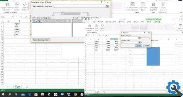
Likewise you can add months, names and dates in the box Select data source; In the edit section located on the right side of the box, click, then choose everything in the cell based on the category, finally click accept.
Add the second axis
add the second axis, click on the series, then right click on the format of the second series, where the values are straight, then on the right side will be available the format of the data series, click on the series option the 3 bars and click on the serial options on the secondary axis.
Like this, in the right area of your chart you will see a new vertical axis, which will match the data of the second series created.
Change the chart type
If you want to change the type of chart, follow the next steps. In your chart, right click on the series you want to change, click change series chart type and in the box change chart type; click the desired chart type.
Also, if you want, you can change or change the size of a chart in Excel, to make it thinner or wider; you can also make it smaller or bigger. In this way you can change its general appearance and thus create a graphic to your liking.
Include the legend in a dual axis chart in Excel
You can also add the chart legend clicking on the graph and signing more that you find in the upper right corner of the graph. Within the options select legend. Click on the triangle on the right, here you can place where you want to insert the legend, or choose the position.
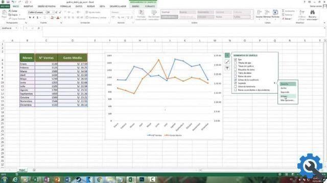
It is convenient to use the legend, as this will give you it will help to know the color that corresponds to the series which represents. Another effective tool is the ability to make changes, such as choosing colors or chart layouts in the chart tools.
Without a doubt, this tool that Excel It provides us , as the two-axis charts, is very useful, since there allow us to effectively manage our finances; and if you have a business you will be able to know the high and low income of your business. Now that you know about this Excel tool, share it if it has been useful to you.