Using Power Point can cause us a bit of fear as its multiple functions and options overwhelm us. We also find it somewhat unbelievable that this program is capable of performing a wide variety of tasks. We can insert videos, insert images, for presentations of great visual quality, create statistical graphs, Gantt charts, etc.
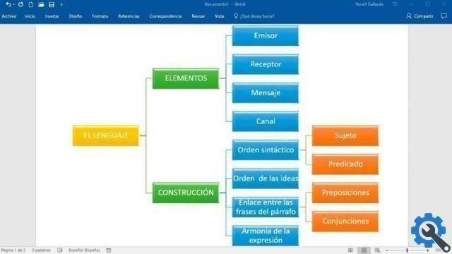
As we have already mentioned, there are many people who can understand or accept an idea better, if it is presented with graphics and with less textual information, it is important to keep this in mind when they make PowerPoint presentations, to attract the attention of more people in the audience.
How to create or create statistical graphs in Power Point
To explain this tutorial we will use the Office program of Microsoft PowerPoint 2016. And we're going to work together with Exel, so let's select a slide and get started. Let's go to the window where we have our Exel spreadsheet , let's start making the table that will contain the graph data.
Let's make the table, it can be small that doesn't contain a lot of data, for example it contains 6 columns and 5 rows. In the columns you can put the days of the week, from Monday to Saturday and in the rows you can put the sales per kilos of a certain fruit. Fill in all the cells with the necessary data.
Once the box is created, we now select it, making a clip in one of its corners and dragging and holding on the opposite corner, until the entire box is selected. Now let's go to the main menu at the top and select Insert. Let's make a clip in Graph, a window will appear with the name of Insert graph, select and click OK.
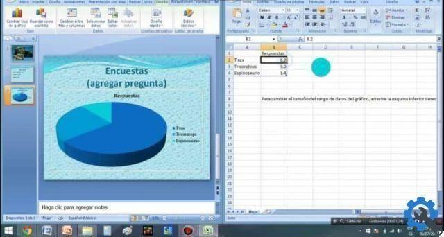
The graph with the values contained in the table will appear, select the graph, right-click on it and select copy. Now let's go to Power Point and we paste the graphics onto the slide. If you can see how compatible they are, the same resolution as the image will be kept.
By having the graphics on the presentation sheet, if we want, we can make some changes. How to make it bigger or smaller, change the letter size, type, whatever we like. You can also include some text, I would do that by going to Insert, then to Text Box and you put your personal touch on it.
Insert graphics from Power Point
We have already seen how to insert graphics in Power Point, create the graphics in Exel, copy it and then paste it into our Power Point presentation. Or the use of action buttons, but in this case we will only use the data contained in the table and we will use a predefined graphic that has the Power Point program.
To do this, we go to Exel and copy the data from the table, then go back to PowerPoint and create a new slide. Let's go up Inserisci and then we create a clip in Graphics, a window will appear with the name of Insert Graphics. We select the chart that best represents my data and click OK.

In the chart we have selected, at the top, a box with the data appears, in that point you will paste the data you copied earlier. You can appreciate that each graphic has different styles and you can choose the one that suits you best for your presentation.
The realization of this project shows us once again that the working tools available to this program are very varied. And we have learned step by step two different ways to create or create statistical graphs in Power point.